008PRINT · EVENT POSTER SYSTEM
Music Festival 2024 – High-Impact Promotional Poster System
A multi-format poster campaign built to carry a three-day music festival across print and digital touchpoints.
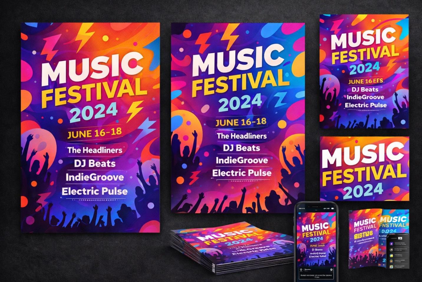
OVERVIEW
This project set out to build a promotional identity for a multi-day music festival capable of translating live-event energy into static visuals. The brief called for a system rather than a single artefact: one that could move from wheat-pasted street posters to phone-screen story frames without losing intensity. The result is a campaign built on light, motion, and scale.
THE CHALLENGE
A festival poster has one job in a crowded environment: stop the scroll or stop the sidewalk. The work needed immediate visual impact and instant headline legibility while still reading as youthful and current. It also had to survive translation across formats — from a wall-sized print to a five-second story view — without the hierarchy breaking down or the energy flattening out.
RESEARCH & STRATEGY
Research into festival marketing pointed toward high-contrast palettes, oversized type, and imagery that trades on collective experience rather than individual portraiture. The strategy settled on an electric gradient moving through purple, orange, magenta, and blue to suggest stage lighting, paired with lightning-bolt accents for a sense of motion and crowd silhouettes layered in to imply scale and atmosphere without naming anyone specific.
ART DIRECTION
The visual language leans on neon-inspired gradients as a constant backdrop, against which bold sans-serif headline type sits in maximum contrast. Lightning motifs cut across the composition to introduce diagonal energy, while silhouetted crowds anchor the bottom of the frame, giving every version — however cropped — a sense of place and occasion. The tone throughout stays energetic, immersive, and unapologetically loud, but never at the expense of the information architecture underneath.
EXECUTION
A master poster established the core visual system before it was adapted into an alternate vertical layout, a square social format, a story-ratio version, and a printed flyer stack, each recalibrated for its own proportions and viewing distance rather than simply resized. Typography hierarchy was locked early so that event name, year, and dates stayed legible regardless of format. A multi-device preview was produced to confirm the system held together as a family.
OUTCOME
The completed system gives the festival a unified, high-voltage identity that holds up whether encountered on a lamppost or a lock screen. Essential information stays instantly readable even as the visual energy stays turned all the way up, giving the campaign the consistency it needs across every channel it touches.